One of our favourite logos is no more - 3 minutes read

Charity rebrands can be tricky business – along with the need to clearly communicate the organisation's mission, there's often a heightened emotional context to the design. In short, a new look won't please everyone. Shelter, the UK's housing and homelessness charity, has revealed a new brand identity – and, not unexpectedly, it's proving divisive.
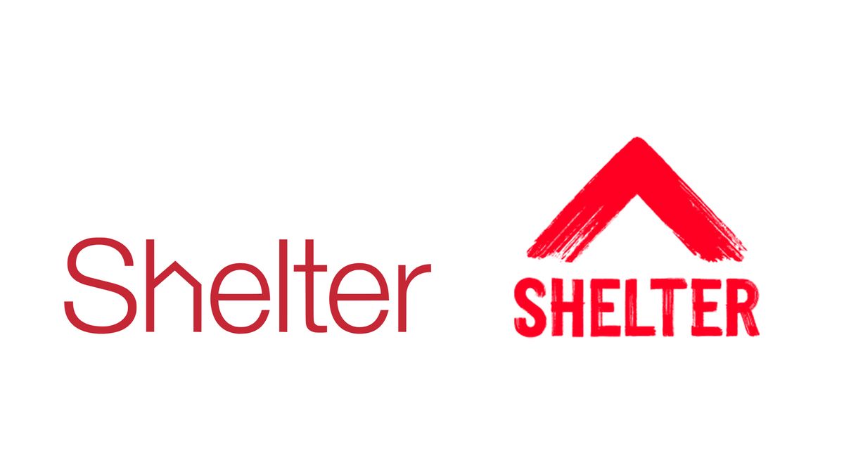
The charity's new logo features a red upwards arrow, made from rough brushstrokes. It's a bold new look, and comes accompanied by a new campaign called Fight for Home. But for those who saw the previous design as one of the best logos around, the new look is going to take some getting used to.
Created by branding agency Superunion, the new logo is a departure from the clean and minimal look of the previous wordmark (above). The agency wanted to revive a sense of the activism that was at the heart of the charity when it was formed in the 1960s. "The new symbol embodies 50 years of campaigning and a never-give-up attitude,” Superunion creative partner Adrian Burton says in a press release. “It’s a symbol that people can recreate, make at home, share and ultimately, take to the streets."
But some (above) are lamenting the loss of that incredibly simple wordmark, with the house shape crafted into the 'h'. While the triangle in the new logo of course references the shape of a roof, it doesn't have the same ingenious subtlety of the original.
Then again, subtlety isn't what Shelter is going for here. The Fight for Home ad (below) is "rallying the country to end the housing emergency", with over 17 million people in the UK are living without a safe, secure or stable home. "The housing emergency has escalated to staggering levels, impacting the lives of one in three of us,” says Willow Williams, head of marketing at Shelter. "This situation demanded an urgent and unflinching campaign to inspire everyone to join Shelter in the fight for home.”
And while some are sad to see the old logo go, others are applauding the charity's bold and striking new look:
While we can see both sides of the debate, we'd say the urgency of Shelter's new identity is more important than holding on to a pleasing design. The previous logo wouldn't stand out on Shelter's new campaign materials, and while the new version isn't as 'clever', it's certainly striking. If you're looking for more inspiration, check out our logo design guide.
Source: Creative Bloq
Powered by NewsAPI.org