Q3 Outlook: Markets Can Remain Irrational Longer Than You Can Remain Solvent - 36 minutes read
 Q3 Outlook: Markets Can Remain Irrational Longer Than You Can Remain Solvent - SPDR S&P 500 Trust ETF (NYSEARCA:SPY)
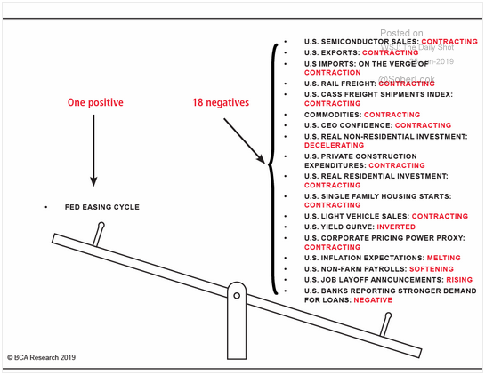
The data shows slowing pretty much everywhere, some of it dating back as far as mid-2016. Many of the headline numbers are masking ugly trends underneath.
Most importantly, non-farm inventories accounted for 83% of GDP growth in 2018 Q3 to 2019 Q1, and Q2 looks like a continuation of that trend.
Outside of IP and warehouse construction, the investment picture is grim. Companies do not see the future cash flow potential from added investment.
The trade war is going very poorly for everyone not named Vietnam.
The markets will not care about any of this until at least after the anticipated July rate, and probably longer.
Fat Bears sit on that right side. From BCA Research and the Wall Street Journal Daily Shot
Anyone who spends a lot of time looking at macro data saw that graphic above in their Twitter feed for a couple of weeks now. The bad news is all over the data, but markets are focused on one thing — synchronized global rate cuts, and the Fed looks to be joining the party.
And for good reason. The traditional link between Fed-provided liquidity and nominal GDP growth has been severed, and Fed liquidity has largely gone to asset price inflation. While this is the case, US dollar-denominated assets will be the thing to own.
But until then, it’s the Everything Rally, so long as it comes in US dollars. Since Powell’s pivot on January 4:
Buy everything. Nothing drives this narrative home more than the unexpectedly good jobs print for June. I believe it will be revised away, but the market reacted so negatively to good news, because it put the precious rate cut at risk. Good news is most definitely bad news.
But the underlying macro picture is weakening, which is the right side of the balance scale in the leading graphic. The overarching picture:
This is not a picture of a healthy economy.
But we could melt up anyway. Enjoy your rate cuts. We’re partying like it’s 1999.
There are many looks we get at the employment situation including the BLS household survey, establishment survey, JOLTS, and unemployment claims.
But nobody spends much time looking at the most accurate employment numbers, which is the BLS Quarterly Census of Employment and Wages. Like the establishment survey, it polls employers about payrolls, but instead of using sampling, they contact over 10 million employers for the census, reaching about 95% of all US jobs. Obviously, this takes much longer, and the numbers are always at least 5 months stale when we get them, which is why they are largely ignored, even though they are far more accurate.
Most ink is spilled writing about the establishment survey — how many “new jobs” the US economy produced in the previous month. There are a couple of problems with that:
BLS Employment Situation Report; BLS Quarterly Census of Employment and Wages
We can see the seasonal patterns in these unadjusted numbers, with a big dip in January and a smaller one in July. The red line is the more accurate census which only takes us through December 2018. As you can see, the establishment survey consistently overstates employment, and even more so since mid-2016. Looking at the spread between the two measures’ levels:
BLS Employment Situation Report; BLS Quarterly Census of Employment and Wages
We also see a seasonal pattern here, most notably the establishment survey drastically understating the July dip. But the spread has been growing since mid-2016. Since June 2016, the employer survey has overstated the YoY growth of jobs by an average of 250,576, 12% of 2018’s 2.12 million new jobs according to the census. The establishment survey put 2018’s growth at 556k higher — 26% — than the more accurate census.
The spread in the YoY nominal changes of the two measures since mid-2016:
BLS Employment Situation Report; BLS Quarterly Census of Employment and Wages
On average, the establishment survey has overstated the YoY growth rate in jobs by 0.15%, or 9% of 2018’s 1.45% census growth rate. The establishment survey put 2018’s growth rate at 0.35% higher than the census at 1.80%.
So the establishment survey has not been very reliable since mid-2016 through the end of 2018 at least. On top of which, the high error rates in the current number make that even less attractive. Despite all the attention the headline receives, I tend to look at the direction of revisions (down for April and May), and ignore the rest.
So how can we look at the current employment situation in a reliable way? Unemployment claims are not the best window, but they are one of the unusual data series, like taxation, where governments are party to every single transaction, so data collection is relatively trivial. About 2 weeks after a weekly reporting period, we get a very accurate number that undergoes only one set of typically very small revisions.
After 8 years of going straight down, the continuing claims moving average reversed pretty sharply in November through mid-March, and then declined even more steeply through the end of April. But the moving average is inching up again since the beginning of May. The 72K establishment survey print for May was not surprising in this light. But the recent June advance print of 224k does not match the more accurate unemployment claims that are inching up. I believe this huge print will be revised away in the coming months, and will wind up closer to the low end of the error range.
So the labor market may not be as tight as the headline numbers suggest, and that is likely the reason for the limp wage and salary growth for the past year or so:
Private wage and salary growth is keeping up with population growth and inflation, but at this point, just barely. We have seen below-median YoY growth rates for about a year now. Note again, the changes happening in mid-2016 that are not reflected in the BLS establishment survey.
Now that we have fully revised data for 2018, we can take a look at how the 2017 tax bill worked out for individuals. It had a very real, but also very small effect on the effective tax rate of about 25-35 bps:
But this was too small to have much of an effect on real disposable income per capita, the bottom line of our personal income tables.
There is little difference between 2018 and 2017. And again, we see a change in mid-2016 not reflected in establishment survey. The YoY growth rates have been below median since February.
So the growth in disposable incomes is decent, but not especially great and declining through H1. Where is the money going?
As always, mostly to consumption:
Again we see a change in mid-2016. As disposable income growth slowed, expenses grew faster, and began taking a larger portion of the total. We’ll dig down deeper on consumption in the next section.
Personal interest payments, which do not include mortgages (counted in consumption as “rent”) have been rising as a percentage of personal income:
About a year after disposable income growth began retreating, interest payments began rising. During much of 2018 and 2019, consumers were taking on more debt than their income growth could handle:
*Any time the ratio is above parity, consumers are taking on too much debt for their income growth.
Like we’ve seen in all these income charts, there’s a change in mid-2016, with more of people’s incomes going to interest and consumption, and less to savings.
Adding it up, the employment and income situation is not nearly as rosy as you have heard. To be clear, we are still gaining jobs, and incomes are still outpacing population and price growth, which are the key things. But job and private wage growth have slowed considerably since mid-2016, though it is not showing up in the BLS establishment survey for some reason, even after final revisions.
About 90% of disposable incomes go to consumption, so this is where much of the action in the economy is. At the top level, services dominate, at about two-thirds of the total. Moreover, there is a huge difference in the inflation rates between goods, which can be imported or substituted when prices rise, and services, which often cannot be.
As you can see, core services inflation runs above the Fed’s 2% target, while goods deflate in price, more so now than at any point in the past 5 years. Together, it adds up to an inflation rate that has only briefly hit the Fed’s target this cycle, largely because of goods deflation. Like the weakening employment situation, the current core rate of 1.60% YoY is signaling a rate cut to the Fed.
We spend a lot of time talking about “core” PCE and PCE inflation, which excludes food and energy. Their prices fluctuate more than others, and are more dependent on commodities markets than consumer demand.
As you can see, food and energy prices (red line) fluctuate wildly, and distort the supply and demand situation being reflected in other prices economy-wide. Removing them gives a better understanding of the “true” inflation situation.
In services, housing and healthcare are the Big Two, together accounting for over a third of total expenditures.
*Percentages are of total PCE, not just services. BEA Table 2.4.6U
Turning to the expense growth rates of the Big Two:
Generally, the growth of spending and prices on services outpaces income growth.
As you can see, even though healthcare (red lines) inflation is muted, health care expenses are rising substantially, which is a reflection of the ACA. More people have insurance, so expenses are rising from increased demand for services. But the cost-cutting measures of the bill are keeping inflation from tracking along with the increased demand, and many of the newly insured are consuming lower-cost Medicaid services. People are getting more for (relatively) less.
Housing is going in the opposite direction, with consumers keeping the growth of their housing expenses in check. But prices are rising at an extreme rate, especially since mid-2016. So in contrast to health care, people are settling for less in order to keep their housing costs from spiraling out of control. We'll discuss a bit more of this dynamic when we get to investment.
Turning to goods is where we see the real trouble beginning for companies. From the top level of consumption:
Food and energy take up about a third of goods, and about 11% of total consumption. Compared to services, growth in goods consumption is much hotter and more volatile:
The growth of goods consumption (red line) is fueled by the deflation in goods prices we’ve already seen above, now more so than at any point in the 5-year window. But I want to focus on those last 6 months, and durables in particular:
So we see demand for durables is driving the overall goods picture. Demand growth dropped considerably in H2 2018, culminating in the December collapse, right in the heart of Christmas shopping season.
But while the core goods prices continue to deflate at a faster rate than the previous 5 years since February (as we should expect from slackening demand), durables, which rely much more on imports, are seeing the inflationary effects of tariffs. To be clear, durables prices are still declining, just at a much slower rate than the previous five years.
The net effect is that continued price declines outside of durables have brought core goods consumption growth back above the 5-year median. But durables consumption has not recovered as much and is way below its 5-year median growth rate. We can boil it down to mostly vehicles and household durables.
Cratering since H2 2018. We’ll see if those May numbers hold up on revision — I am skeptical. And inflation:
*The 5-year deflation rates are so far down, I had to squeeze them in.
We would expect a cratering of demand that we see in the first chart to lead to steep price cuts. But tariffs are driving up costs to producers, and they are trying, unsuccessfully so far, to pass these on to consumers.
So what is happening is that wholesalers and retailers are being stuck with a ton of inventory which they cannot unload without destroying margins. From July 2018 through March 2019, 83% of the growth in the US economy was still sitting in warehouses and car lots. Trying to maintain prices in the middle of that will not be helpful, though as you can see, it looks like appliance retailers are starting to give into the inevitable.
The overall picture in consumption and prices:
Outside of IP investment, which continues to blow out quarter after quarter, other areas of fixed investment are slowing. Beginning with non-residential construction, the first thing is that growth in this category is being driven by warehouse construction.
Less than 6% of all nonresidential construction investment, it accounted for 53% of the Q1 growth. As you can see, manufacturing construction had a big turnaround quarter that got better with revisions.
But the YoY growth rate in non-residential construction is going in the wrong direction, and now below the 5-year median in Q1.
One reason is that construction inflation is trending well above the 5-year rate:
All the major categories are showing above-trend inflation, and mostly substantially so. Low interest rates will not fix that.
Residential investment is in really terrible shape:
With PCE housing inflating at 3.45%, over double core PCE inflation, we should expect residential construction to be booming. But as you see, the opposite is true, with the top line declining at nearly 4% in the YoY and single family construction cratering to the tune of 12% YoY.
The problem is that tastes are changing, but zoning laws prohibit developers from building what people want: dense multifamily housing close to where they work, and transportation hubs. The problem is particularly acute in coastal cities, where wages are high, demand is high, but housing supply in desired central areas remains constrained by zoning laws that reflect homeowner tastes from the 1950s and 1960s, and the demands of current rent-seeking homeowners.
The solution of course, is to change the zoning laws, like they have in Seattle, upzoning single-family lots to duplex/triplex. This chart is the spread between the inflation rate of rent in Seattle to the rest of the country. As you can see, Seattle rent inflation has come way down relative to everywhere else, and is now below the national average:
In any event, regardless of housing inflation, builders will not be able to build what people want under most current zoning laws. They learned the last go-around that building cheap subdivisions far out of central areas where no one wants to live only buys you bankruptcy.
On the equipment side, it’s all headed in the wrong direction. YoY growth rates:
The equation on the top-left is the fitted line for top-line equipment growth (blue/white circles). It’s predicting a 1.46% reduction per quarter (about 6% annualized) in equipment investment, and the current GDPNow nowcast has the equipment investment growth rate going down by 1.73% (7.1% annualized).
Like with non-residential construction, the inflation rate for equipment is rising, despite declining demand:
Only transportation is even close to its 5-year inflation rate.
So adding it all up, everything outside of IP investment and warehouse construction is doing pretty poorly. When we make an “ex-IP” category for fixed investment, the difference is stark:
*Numbers normalized to 100 for 2014 Q1. Percentages are 5-year CAGRs. BEA Table 5.6.6U
IP (green) has been growing faster than everything else. Zooming in on the last 5 quarters, the spread between IP and ex-IP growth rates:
In Q1, the difference was almost 9%.
So what’s going on here? Let’s look at it through another lens.
For the S&P 500 companies in 2018, in billions of nominal dollars:
So, all of 2018 profits went back to shareholders. Increased fiscal and central bank liquidity are not having their intended effects on investment behavior, but rather is being used to inflate asset prices.
To put this in context, all US companies spent an additional $251 billion in nominal dollars over 2017 on fixed investment in 2018. Instead of adding to that, just the S&P 500 companies chose to return $1.26 trillion to shareholders, a $324 billion increase over 2017, the previous record year. This should tell you everything you need to know about how corporate leadership views organic earnings growth prospects.
Moreover, this is nothing new; it has been going on since 2014. In those five years, buybacks and dividends for the S&P 500 totaled 106% of GAAP earnings for a net cash flow of -$296 billion in nominal dollars. These 500 companies went into a combined $296 billion in new net debt to fund this, instead of using those earnings and low interest rates to increase CapEx.
But everyone is a tech company now, and all sorts of non-tech businesses are making significant investments in customer apps and backend capacity, so that seems to be where all the investment is going to. Insert your own “Learn to Code” joke here.
On the one hand, we can see it as companies changing their capital structures, converting some of their equity to debt at excellent terms. But it remains to be seen whether long-term cash flows can support these new debt levels, especially when notes start coming due.
Non-farm inventories have been the Big Kahuna since 2018 Q3.
Inventories, like prices, sit at the nexus of supply and demand. Supply and demand are fuzzy concepts, but inventories together with prices give us ways to measure how supply and demand are interacting. We can easily strip out price effects with PCE deflators, which leaves us with inventories.
In the imaginary world of purely theoretical economics, where information is perfect all the time, and all transactions are frictionless, there would be no inventories. Every day, whatever inputs every company needed for that day - no more and no less - would appear magically at the loading dock in the morning and be depleted by day's end. Everything would forever be at the market-clearing price, and peace will reign over all corporate entities.
But, of course, this is not the real world. Information is far from perfect, and transactions have plenty of friction. Companies must project forward and many things can affect that. Sometimes they overshoot, sometimes they undershoot - both are dangerous and it's important to quickly correct the error. So, in a healthy economy, changes in inventories should always be trending toward net zero in the long term. Eventually, they have to get there or the market cannot clear.
On the micro level, inventories are a measure of operational efficiency. Companies with regularly high inventories relative to sales are having trouble projecting demand and are shrinking margins as a result.
On the macro level, it tells us how well companies economy-wide or in different sectors are projecting demand. The worse they do, and the more correlated their bad decisions are, the more the danger to the economy becomes.
Most post-war recessions revolve around highly correlated inventories. Of course, the Ur-bubble, the Dutch tulip craze, was all about high inventories of tulips. The last recession was started by high inventories of housing.
The "value" of inventories are just a number on a balance sheet - we think our inventories are worth this much. But when prices plummet due to oversupply, the actual value is somewhere between what's on the balance sheet and zero, and it can leave a giant hole. If many companies or banks have highly correlated balance sheets, then systemic liquidity collapses, and we wind up bailing everyone out because the alternative is worse.
I’ve included the most recent Atlanta Fed GDPNow nowcast for 2019 Q2, and as you can see, the problem is only getting worse. From 2018 Q3 to 2019 Q1, 83% of total real GDP growth went into non-farm inventories. Including the Q2 nowcast, that rises to 89% for the trailing year.
Ex-inventories, 2 of the last 3 quarters will have been slightly recessionary if the GDPNow nowcast turns out to be correct.
I went over this in great detail a couple of months ago, but the basic story goes like this:
Coming out of the blockbuster 2018 Q2 where companies could not keep up with demand and inventories fell, consumer and CEO confidence were at all-time highs. Everything was looking like it was set up for a huge Christmas retail season (I certainly thought so).
But tariffs were coming in the fall, so companies built up inventories in advance of those. When demand remained hot in November, wholesalers piled up even more inventories in anticipation of a massive Christmas push that never came.
Demand cratered in December. Many people were traveling out of the country, and as we’ve seen, income growth was stagnating on top of it. We’ve seen a recovery from the December lows in demand, but by the time that happened in March, the problem had spread to retailers and manufacturers.
About a third of the new inventories are light trucks, split pretty evenly between used and new. The “new” inventory has a lot of last year’s models, which are not very new in consumers’ eyes. The rest is mostly other consumer durables, like the furniture and major appliances we were looking at.
As we’ve seen, goods prices are deflating rapidly, so the longer things sit around, the less they are worth. It hasn’t happened yet, but I expect large inventory impairments to begin sometime during H2 2019.
For some wholesalers, May was a decent bounce from a terrible April. Annualized growth rates:
The key columns are the last two, where we see the tremendous growth in inventories everywhere, without sales growth to justify it. May saw a recovery for some wholesalers from a dismal April, as seen in the red numbers in the “I-S Ratio MoM" column. Two of the last three reported months (March and May) now show core wholesalers going in the right direction.
As you can see, sales (blue line) is pretty flat, while inventories and the ratio are climbing every month but March and the slight downturn in the purple line in May. Keep watching the purple lines in these.
Through April, sales were just above 0% growth for the 10 months, with inventories up 17%. Moreover, many of these sales are for used light trucks, which sends no money in the pockets of the automakers. If it holds on revision, May looks like the first decent month for auto dealers in a while.
Lumber and construction supply wholesalers are having a particularly disastrous run.
The terrible residential construction situation likely has something to do with this. But there are also just too many tree products laying around. Paper and paper products:
They did OK at first, but once demand collapsed in December, they lost control of their inventories, and the ratio skyrocketed.
But it's not just lumber and construction supplies piling up for the Home Depots (HD) of the world. Hardware, plumbing, etc. are also stacking in warehouses.
Appliances and furniture are also driving the terrible consumer durables situation, despite the May bumps.
As you can see, the furniture wholesalers are doing a little better, boosted by some decent Q1 sales.
We've also seen a lot of high inventories among industrial and capital goods. Machinery is one of the few problem areas that had a bad May.
Finally, clothing, which is the most troubled of the non-durable categories. Here we are seeing steep price cuts in 2019 and it is working to some extent.
How’s the trade war going? You already know the answer to that:
Census Bureau. Numbers normalized to 100 for July 2018. Percentages are annualized growth rates.
Since May 2018, total US trade is up 1.2% with imports up 3.3% and exports down at a 1.3% rate. The net effect the deficit has risen at a 25% rate. Things are going swell!
Breaking it down in goods, where the deficit lives, YTD annualized growth rates:
Led by consumer goods, the deficit is going up at an annual rate of over 11% this year.
China being the main focus of the trade war, here’s what that looks like since the end of 2017.
Census Bureau. Levels normalized to 100 for December 2017. Percentages are annualized growth rates.
Total trade with China is down at a 12% annualized rate since December 2017. Exports to China are down at a stunning 25% rate, and imports down 8%, with the net effect of the deficit being flattish at -1.5%.
Countries like Vietnam have been happy to pick up the slack.
Census Bureau. Normalized to 100 for December 2018. Percentages are annualized growth rates.
Since December 2018, US total trade with Vietnam is up at an annualized rate of 93%, and the bilateral deficit with them is up 136% annualized. Exactly according to the White House’s plan, right?
The Chinese have shifted into 5000-Year Mode, and I don't think it is just rhetoric. I believe they will attempt to maintain “truces” as much as they can, and work their way around the current 10% tranche like they are with Vietnam.
Everyone in the world saw the same thing when Trump threatened Mexico with tariffs after signing a new NAFTA agreement: neither Trump’s word nor even his signature in black Sharpie is worth anything. The Chinese will wait him out. If it is 18 months, then this is over quickly. If it is 5.5 years of waiting, the Chinese can do that standing on their heads.
I wrote this at the end of last year, but it still holds in my mind:
This is going swell!
You’ve of course heard plenty about the yield curve, which has been inverted for over a quarter now. In normal circumstances, there is a risk premium with time. I’m pretty close to 100% confident that the US Treasury will be around to pay off its 1-month bill, but my confidence is something less than 100% for the 30-year bond, so I will require more interest for that added risk. In normal circumstances, the yield curve slopes upward, like back in November.
The 2-5 year maturities have been inverted with the 6-month bill since December and the 7 and 10 followed this year. The entire curve is well below Fed Funds, the shortest duration rate there is — overnight. Moreover, the 2-5 year notes are just barely above core inflation.
This is even with a huge steepening of the curve at the end of last week.
What is going on here is that investors believe that rates will continue to decline, and the value of their notes will rise. When you are buying 3-year debt at 21 bps above inflation, you are not that concerned with the interest. Moreover, the highest money market rate I know of is 2.57%. No one is buying the 3-year, in huge demand, because they want to give up 76 easy, liquid bps of return.
Because of this, the yield curve has become a very strong predictor of recession. To be clear, it is not the cause of recession, though upside down yields will hurt banks who rely on borrowing short and lending long.
So the curve tells us markets are anticipating easing back to 220-ish bps within 3 months (probably sooner), and heading down from there through the next 3 years. The curve tells us the market is pricing in ~75 bps of easing in the next year, and declining further from there.
What would cause that to happen? A recession, most likely.
Since it has been shown to be a pretty good predictor of recession, the NY Fed has a recession prediction model based around the 10-year to 6-month spread. The probability of recession in a year out:
As you can see, the 1-month moving average has been in the 29-33% range since late May. This is very high.
Baby Godfather wants his rate cuts. Better give it to him. KYM
The Fed will ease. Are you happy now?
You shouldn’t be. Easing is a sign the economy is slowing — that’s why the yield curve has been such a good recession predictor.
Despite a high core CPI print for June of 2.1%, above the 2% target, the much more accurate Core PCE inflation remains at 1.6%, and would be closer to 1% if the housing situation wasn’t so distorted by outdated zoning.
And as Powell was forced to admit in testimony this week, there is still plenty of slack in the labor market, and we are not seeing inflation being caused by the low unemployment rate. As Powell admitted, the Fed’s estimates of future inflation have been wildly off the past few years. So there’s no reason not to cut.
Well, there is one reason:
Rates are historically low. In fact, in the last two cycles, we barely popped above the median. Zooming in:
*Green dashed line is the median since the end of the 2001 recession in October 2001
As you can see, in the last cycle, the Fed did not raise the rate very high by the end of the cycle, topping out around 5.25%. This left the Fed without enough ammo to fight the Great Recession when it hit, and they had to resort to QE. Neither of these “emergency” measures have been unwound, so they have effectively monetized the debt.
Now it looks like we will top out this cycle at around 2.45%, which we hit in April. If there was not enough ammo in 2008, there is certainly not enough in this go around. The Fed will likely have to resort to negative interest rates, more QE, and their balance sheet will begin to resemble the absurdity of the Bank of Japan.
With European rates in negative territory, and even negative rate junk bonds, we see a glimpse of a possible future: low growth, low interest rates and low inflation, with Central Bank policy helpless to fix it.
We are all turning Japanese.
Why? For years I thought this was because of overly accommodative policy by the BOJ, but I’ve come around to thinking that this phenomenon has more to do with demographic trends than policy. Working-age population growth is slowing or negative all over the developed world, and the dependency ratio (the ratio of 16-64 year-olds to 65+), is very high and projected to keep growing.
Productivity gains by working age people are being spread too thin. Germany is about 10 years behind Japan, and the US is about 10 years behind the Germans. We are in a Land Beyond Fed Policy.
So enjoy your cuts! They will not have the intended effect of juicing nominal GDP, which looks to hit a 4-year low in Q2, but they will inflate dollar-denominated asset prices. As the Marines say, get some.
Likely, we are looking at ~75 bps cuts in the next year, or at least bond traders and bank analysts seem to think so. I am less sure than them, but it seems about right.
I believe the S&P 500 will top out in the range of 3150-3200 for a bit, and then we can kiss this cycle goodbye. Enjoy while you can.
This is a weekly linear regression model of the S&P 500 since March 2009 when it bottomed.
The red lines are 0.5 standard deviation channels, and as you can see, they capture the action quite well. I believe we have one more bounce off that top red line, currently at 3162. I think the top in 2000 is instructive:
Since late fall, I have felt we are in the same sort of irrational end-of-cycle psychology that characterized the late 1990s and 2000. Then, everyone was chasing growth, whether it led to profit or not. Today, it’s Fed-sponsored liquidity, whether it leads to inflated GDP or not.
I’ve highlighted some of the analogous recent moves, like the December collapse, the H1 2019 recovery, and the recent surge off rate cut anticipation. Like in 2000, I believe we will hit a new all-time high, somewhere in the range of 3150-3200, hang out there for a few months, and then the end will be upon us.
I remain a Fat Bear, hibernating in my cave, at about 80% cash in my actively managed accounts (about ⅓ of my holdings is passive instruments I never touch). If the market surges to 3200, that will be 7.5% that I will be resigned to miss out on. I believe we are about to enter a period of extreme volatility, like the 1999-2000 period above. Adding the VIX to the previous chart:
Do you think I’m looking at August VIX calls? You bet I am.
Too long? Didn’t read? Here are some handy bullets to impress your friends, so long as they're econ geeks.
Disclosure: I/we have no positions in any stocks mentioned, and no plans to initiate any positions within the next 72 hours. I wrote this article myself, and it expresses my own opinions. I am not receiving compensation for it (other than from Seeking Alpha). I have no business relationship with any company whose stock is mentioned in this article.
Source: Seekingalpha.com
Powered by NewsAPI.org
Keywords:
Solvency • SPDR S&P 500 Trust ETF • Gross domestic product • Intellectual property • Construction • Investment • Company • Cash flow • Investment • Trade war • Vietnam • BCA Research • The Wall Street Journal • Twitter • Federal Reserve System • Liquidity risk • Gross domestic product • Federal Reserve System • Market liquidity • Asset price inflation • United States dollar • Asset • United States dollar • Weighing scale • Picture This (Wet Wet Wet album) • Health • Economy • Happiness • Religious education • Employment • Bureau of Labor Statistics • Business • Unemployment • Bureau of Labor Statistics • Quarterly Census of Employment and Wages • Business • Survey methodology • Employment • Sampling (statistics) • Employment • Census • Employment • Accuracy and precision • Bureau of Labor Statistics • Bureau of Labor Statistics • Quarterly Census of Employment and Wages • Red Line (Washington Metro) • Accuracy and precision • Census • Survey methodology • Bureau of Labor Statistics • Bureau of Labor Statistics • Quarterly Census of Employment and Wages • Business • Survey methodology • Employment • Survey methodology • Economic growth • Employment • Arithmetic mean • Employment • Census • Business • Survey methodology • Economic growth • Higher education • Accuracy and precision • Census • Statistical dispersion • Gross domestic product • Bureau of Labor Statistics • Bureau of Labor Statistics • Quarterly Census of Employment and Wages • Survey methodology • Economic growth • Employment • Census • Economic growth • Survey methodology • Economic growth • Census • Survey methodology • Reliability engineering • Unemployment • Tax • Government • Data collection • Accuracy and precision • Moving average • Moving average • Unemployment • Labour economics • Wage • Salary • Wage • Salary • Population growth • Inflation • Median • Economic growth • Bureau of Labor Statistics • Official statistics • Tax rate • Basis point • Disposable and discretionary income • Survey methodology • Economic growth • Median • Income • Money • Consumption (economics) • Disposable and discretionary income • Economic growth • Consumption (economics) • Interest • Mortgage loan • Consumption (economics) • Economic rent • Percentage • Personal income • Disposable and discretionary income • Economic growth • Interest • Consumer • Debt • Economic growth • Ratio • Purchasing power parity • Consumer • Debt • Income • Economic growth • Income • Social change • Person • Income • Interest • Consumption (economics) • Wealth • Employment • Income • Market clearing • Employment • Income • World population • Price • Economic growth • Job • Private sector • Wage • Economic growth • Bureau of Labor Statistics • Business • Survey methodology • Economy • Service (economics) • Inflation • Price • Inflation • DEFLATE • Inflation • Federal Reserve System • Business cycle • Deflation • Employment • Interest rate • Interest rate • Federal Reserve System • Time • Personal consumption expenditures price index • Personal consumption expenditures price index • Inflation • Food • Energy • Price • Commodity market • Demand • Food • Energy • Price • Red Line (Dubai Metro) • Supply and demand • Price • Economy • Inflation • Service (economics) • Big two • Personal consumption expenditures price index • Service (economics) • Expense • Economic growth • Big two • Price • Service (economics) • Income • Health care • Inflation • Health care • Patient Protection and Affordable Care Act • Insurance • Supply and demand • Service (economics) • Inflation • Supply and demand • Medicaid • Service (economics) • Consumer • Economic growth • Expense • Price • Interest rate • Health care • Cost • Investment • Goods • Company • Consumption (economics) • Food • Energy • Goods • Consumption (economics) • Service (economics) • Economic growth • Goods • Consumption (economics) • Volatility (finance) • Economic growth • Goods • Consumption (economics) • Red Line (TRAX) • Deflation • Goods • Price • Durable good • Demand • The Heart of Christmas • Christmas and holiday season • Goods • Price • Interest rate • Demand • Durable good • Import • Inflation • Tariff • Durable good • Interest rate • Price • Durable good • Goods • Consumption (economics) • Durable good • Consumption (economics) • Economic growth • Inflation • Deflation • Supply and demand • Price • Tariff • Cost • Consumer • Wholesaling • Retail • Inventory • Economic growth • Economy of the United States • Warehouse • Car • Price • Middle class • Home appliance • Retail • Consumption (economics) • Intellectual property • Blowout (well drilling) • Fixed investment • Construction • Inflation • Inflation • Interest rate • Investment • Personal consumption expenditures price index • Inflation • Personal consumption expenditures price index • Inflation • Family • Zoning • Multi-family residential • Wage • House • Supply and demand • Zoning • Owner-occupancy • Rent-seeking • Zoning • Seattle • Land lot • Duplex (building) • Duplex (building) • Inflation • Renting • Seattle • Seattle • Economic rent • Inflation • Zoning • White • Military technology • NowCast (air quality index) • Military technology • Investment • Economic growth • Construction • Inflation • Military technology • Demand • Transport • Inflation • Intellectual property • Construction • Intellectual property • Fixed investment • Wave function • S&P 500 Index • Company • 1,000,000,000 • Real versus nominal value (economics) • Profit (accounting) • Shareholder • Finance • Central bank • Market liquidity • Causality • Investment • Behavior • Valuation (finance) • Company • Real versus nominal value (economics) • Fixed investment • S&P 500 Index • Company • Shareholder • Dividend • S&P 500 Index • Accounting standard • Earnings • Cash flow • Real versus nominal value (economics) • Company • New.net • Debt • Income • Interest rate • Capital expenditure • Technology • Company • Technology • Business • Investment • Customer • Application software • Investment • Company • Capital (economics) • Equity (finance) • Debt • Cash flow • Debt • Inventory • Big Kahuna (series) • Inventory • Price • Reservoir simulation • Supply and demand • Supply and demand • Concept • Capitalism • Causality • Personal consumption expenditures price index • Information • Corporation • Reality • Information • Overshoot (signal) • Risk • Economy • Inventory • Corporation • Inventory • Supply and demand • Macroeconomics • Company • Economy • Supply and demand • Correlation and dependence • Risk • Economy • Recession • Economic bubble • Tulip mania • Tulip • Recession • Inventory • Value (economics) • Balance sheet • Price • Value (economics) • Balance sheet • Market liquidity • Liquidation • Atlanta • Federal Reserve System • NowCast (air quality index) • Calendar year • Calendar year • Calendar year • Gross domestic product • Calendar year • NowCast (air quality index) • Chief executive officer • Christmas • Retail • Demand • Demand • Inventory • Durable good • Furniture • Goods • Price • The Now Show • Blue Line (MBTA) • Purple Line (CTA) • Automotive industry • Lumber • Construction • Lumber • Construction • Plumbing • Home appliance • Furniture • Durable good • May Bumps • Furniture • Wholesaling • Industry • Capital good • Machine (mechanical) • Trade war • Census • Standard score • Trade • Import • Export • Balance of trade • Year-to-date • Final good • China • Trade war • Census • Standard score • China • Export • China • Vietnam • Census • Standard score • Economic growth • United States dollar • Trade • Vietnam • Bilateralism • Balance of trade • White House • China • Rhetoric • Tranche • Vietnam • Mexico • North American Free Trade Agreement • Sharpie (marker) • Chinese people • Yield curve • Risk premium • United States Department of the Treasury • Consumer confidence • Bond (finance) • Interest • Risk • Yield curve • Maturity (finance) • Federal funds • Interest rate • Core inflation • Investment • Value (economics) • Debt • Basis point • Inflation • Interest • Money market • Supply and demand • Market liquidity • Basis point • Yield curve • Recession • Recession • Negative equity • Yield (finance) • Bank • Short (finance) • Loan • Long (finance) • Market (economics) • Basis point • Market (economics) • Basis point • Recession • Dependent and independent variables • Recession • Recession • Prediction • Mathematical model • Statistical dispersion • Probability • Recession • Moving average • Range (statistics) • Interest rate • Federal Reserve System • Are You Happy Now? • Economic system • Yield curve • Goods • Recession • Dependent and independent variables • Consumer price index • Personal consumption expenditures price index • Inflation • Zoning • Labour economics • Inflation • Unemployment • Federal Reserve System • Inflation • Early 2000s recession • Business cycle • Federal Reserve System • Interest rate • Business cycle • Federal Reserve System • Great Recession • Quantitative easing • Unwound • Monetization • Debt • Business cycle • Federal Reserve System • Interest rate • Quantitative easing • Balance sheet • Bank of Japan • European Union • Tax rate • Deflation • Deflation • High-yield debt • Futures contract • Economic growth • Interest rate • Inflation • Central bank • Public policy • Turning Japanese • Bank of Japan • Public policy • Population growth • First World • Dependency ratio • Germany • Japan • Germany • Steroid • Gross domestic product • Basis point • Bond market • S&P 500 Index • Linear regression • S&P 500 Index • Standard deviation • Red Line (Pittsburgh) • Psychology • Economic growth • Profit (economics) • Market liquidity • Inflation • Gross domestic product • Hibernation • Volatility (finance) • VIX • VIX • TL;DR • Seeking Alpha • Stock market •