Google Chat's new logo is finally blending in with its productivity pals - 2 minutes read
What you need to know A new patent application reveals that Google Chat is getting a new logo that is more in line with other Google productivity apps.The new logo is green with some blue and yellow, and features two chat bubbles, one inside the other.The new logo is expected to roll out in the coming months, along with other updates to Google Chat.
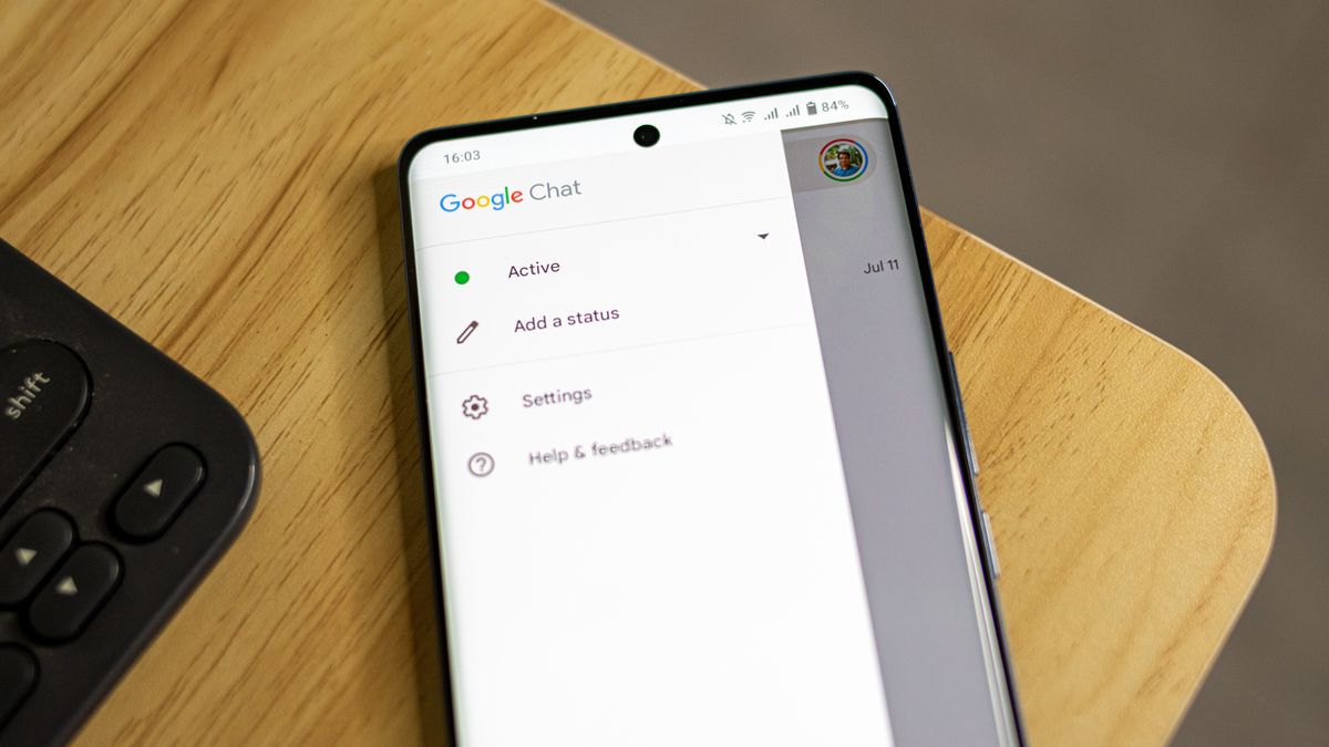
Google Chat's new logo appears to be finally speaking the same design language as its productivity peers, if a new patent filing is any indication.
The search giant previously showed off a four-color icon for Google Chat at its Workspace Summit in May. It had two chat bubbles, one inside the other. The outer bubble was colorful and angular, and the inner bubble was formed by the empty space inside it. Although the new look was not official then, it did fit in with the changes we've seen in other Google app logos.
First spotted by 9to5Google, a seemingly final look at the app's logo puts it in the same class as Google's other productivity apps. The redesign surfaced via a US Patent and Trademark Office filing, and it looks like the one we saw in May. It's mostly green, with some blue and yellow, and just a touch of red.
You can see the difference between the earlier and new versions in the image below.
Google Chat's redesigned logo shown off in May (left) and the final icon (right) (Image credit: 9to5Google)Google's been on a bit of an icon makeover spree lately, slapping its signature four-color palette onto all its apps. While this newfound consistency is great for brand identity, it might make it harder to find the right app quickly.
On the other hand, the current Chat icon looks like two chat bubbles overlapping in dark green. Google probably chose this color to make people remember Google Hangouts, the old version of Chat, and help them find the new app easily.
However, in the quest for a cohesive brand image, Google might have overlooked the need for visual distinctiveness. After all, what good is an app icon if you can't spot it in a jumble of its identical peers?
So, Google, while we appreciate the effort in creating a harmonious app ecosystem, maybe next time, go a little easier on the color coordination. Our tired eyes and fumbling fingers will thank you.
Source: Android Central
Powered by NewsAPI.org