How to Create a Custom Color Palette for Your Home, According to an Expert - 5 minutes read
 As a home decor enthusiast, there are few things more appealing in life than an empty room. With no paint, and no furniture, it’s a real opportunity to decorate from scratch. What a dream!
Whether you’re decorating (or redecorating) a room or an entire home, one of the best places to start is to decide on a color palette. And sure, you could go on Pinterest and pick one, but what if you created a personal color palette that’s 100% you? Wouldn’t that be so much more fun?
For some expert insight on how to create a custom color palette for your home, we asked designer and artist Rebecca Atwood for her best tips. Her new book, Living With Color: Inspiration and How-Tos to Brighten Up Your Home, is all about using color in your home. Here’s what she recommends, from start to finish.
You probably have an idea of what colors you like, but just saying “blue” is far too vague. Don’t believe us? Try going to a paint store and asking for blue paint. You’ll only get a few hundred shades of blue to choose from.
For this reason, you’re going to have to narrow down your color to specific shades, and to do this, Atwood recommends searching for inspiration in the real world.
“Go on a color hunt—on a walk, at the museum, around the grocery store, out in nature—and really notice what colors you're drawn to,” says Atwood. “Write down notes, take photos, and really observe.”
You might also want to draw inspiration from the past, or images you draw from memory. Maybe you went on a trip to Santorini last year and can’t stop thinking about its iconic blue roofs. Those colors definitely belong in your color palette.
“Think about the places you love the most,” Atwood recommends. “Imagine a landscape and pull out all the colors from it.”
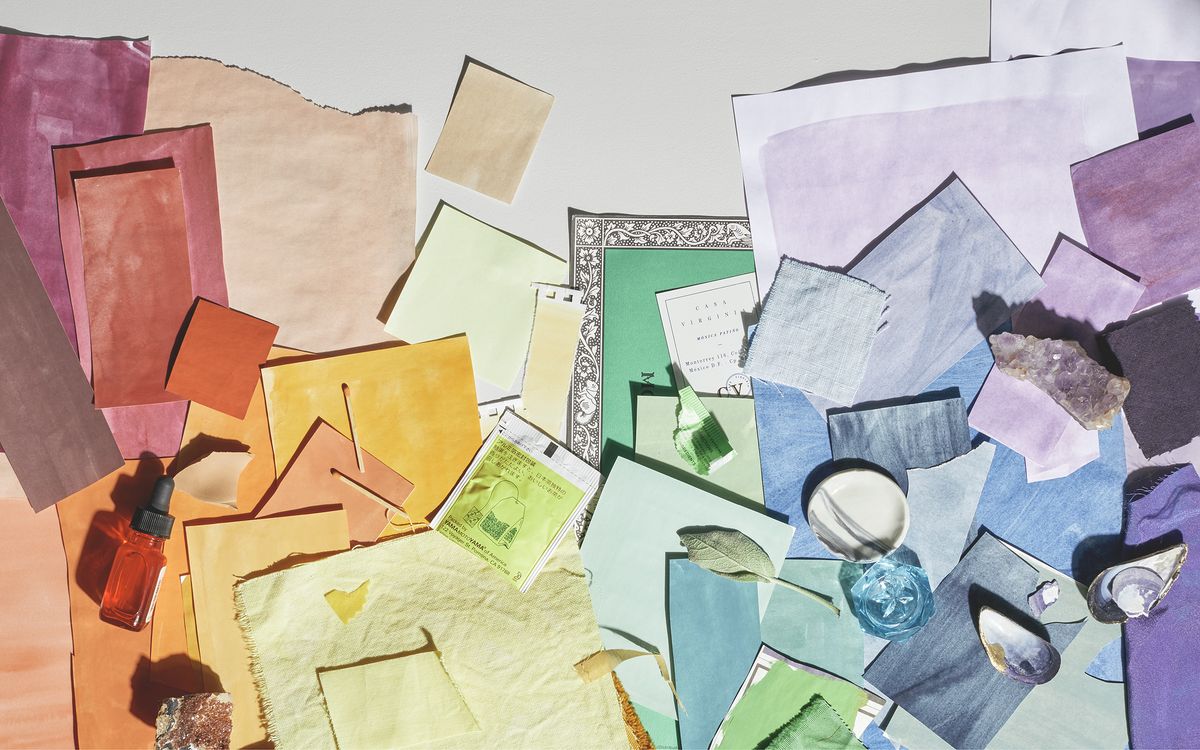
Once you have several colors in mind, the next step is to find physical objects in those shades.
“Collect physical versions of the colors you're drawn to—paint chips, fabric swatches, small objects, tears of paper—and lay them out to see how they look together,” suggests Atwood.
Colors can look quite different on your computer or phone screen than they do in real life, so if you’re planning to decorate with these shades, you’ll want physical swatches of them. As you collect the objects, begin to create a color wheel by laying them out in a circle.
Feeling good about your color selection? You’re almost done! Take a step back and consider how your palette feels as a whole. Are there a lot of bright, saturated colors? Or, conversely, maybe it’s a lot of delicate, gentle hues? You’ll want to balance your selections out to ensure it’s not over- or underwhelming.
“Remember to pick neutrals that connect to the more saturated colors in the palette,” says Atwood. Don’t worry, though—your “neutrals” don’t have to be boring tans. They just need to be more understated hues that tie your bright shades together. “For example a sandy taupe-pink to go with a peach and tomato, or a gray-lilac to go with a blue.”
In general, Atwood recommends using five colors in total, including
It might take a little while to mix, match, and pare down your selections, but take your time and enjoy the process. It’s an artistic endeavor and, as such, shouldn’t be done overnight.
Once you’re happy with your color palette, it’s time to start decorating. You don’t necessarily have to pick out wall paint first, explains Atwood in her book. Sometimes it works better to find a couch or other furnishing you love, and then decorate around it.
Another option is to sketch out how you want the room to look. Use paint or colored pencils to illustrate a few options—try a neutral color on the wall and a bold couch, then reverse them to see which you like better.
On a similar note, Atwood also recommends playing with the amount of each color to change the mood of the space: “Remember the proportions of the colors you use can give the palette a different mood. Darker tones will make the room feel moody, while mid-tones will feel cozy, and light-tones, airy.”
When you use these steps to create a personal home color palette, you’ll be able to design an interior that’s uniquely you, and brings you joy every single day.
Source: Food52.com
Powered by NewsAPI.org
Keywords:
Interior design • Life • Furniture • What a Dream • Pinterest • Alternate history • Paint • Shades of blue • Color • Color • Nature • Color • Image • Santorini • Color • Color • Color • Mind • Color • Paint • Integrated circuit • Textile • Paper • Color • Color wheel • Feeling Good • It's Not Over (Daughtry song) • Brightness • Tints and shades • Taupe • Pink • Peach • Tomato • Syringa vulgaris • Take Your Time (Sam Hunt song) • Paint • Couch • Paint • Space • Memory • Color • Light •