The Invention of Time - 6 minutes read
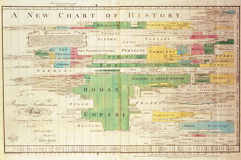
Folded up, the heavy paper of Joseph Priestley’s 1785 timeline forms a cardboard-like wafer. It seems too slim to contain so much. The copy I studied was sewn into a book, sandwiched between a genealogy and some illustrations. Once unfolded, the timeline confronted me with a jumble of horizontal lines, chased by minuscule lettering. Gradually, the lines resolved into a chart. Time marches from left to right, and the lines represent lives, painstakingly plotted and labelled. The ambition of the Chart of Biography is breathtaking. On a single sheet of paper, Priestley systematically displayed over 2,000 figures, from 1200 bc to the present. In the mid-18th century, that meant almost all of history. Priestley’s Chart thrived, swiftly spawning dozens of imitations. Today, timelines are so widely used it is hard to imagine a time when we were without them. What led Priestley to this invention? The answer partly lies in his views on time.
Priestley (1733-1804) is best known for his scientific work, especially the co-discovery of oxygen. Yet he was also a teacher and a philosopher. As a teacher, Priestley sought to better communicate history to his students. He was fascinated by chronologies, texts ordering events. Since ancient Greece and Rome, chronologers used ‘time tables’ or grids to depict the order of events in time. An obvious problem with these chronologies, though, is that only so many events can fit on each page.
The mid-18th century saw many experiments in representing history, including Thomas Jefferys’ 1753 A Chart of Universal History. Jefferys was a mapmaker and his chart depicts empires almost as though they are countries on a map, allowing you to scan them all at once. Impressed, Priestley determined to create a chart of his own that readers could scan ‘at one view’. He made several innovations but one proved key: lines, inspired by his philosophy of time.
For this, Priestley drew on a seemingly unconnected topic: John Locke’s 1690 account of abstract ideas. For Locke, abstract ideas include ‘redness’, ‘triangle’, or ‘animal’. They are general ideas, produced when our minds consider particular things. Take a pint of milk, a stick of chalk and a lump of snow. I can consider these things while leaving out their particular features, ‘abstracting’ what is common to them: their whiteness. Many philosophers accepted some version of Locke’s account of abstraction, but puzzled over how to mentally visualise them. Locke writes that our abstract idea of a triangle ‘must be neither Oblique, nor Rectangle, neither Equilateral, Equicrural, nor Scalenon; but all and none of these at once’. Clearly we cannot picture such a thing. Priestley makes an alternative suggestion: represent abstract ideas using a variable particular. A child, he writes, has an idea of ‘what a triangle in general is’, even though all the ideas of triangles he ‘contemplates’ are ‘particular’. In other wrds, our picture of the abstract idea of a triangle can change: from equilateral to, say, scalene. In the same essay, Priestley argued that time is an abstract idea. And this view feeds into his timeline.
Priestley’s timeline was so new that he published a small book alongside it, explaining its underlying principles. A Description of a Chart of Biography sought to justify representing times using lines:
As no image can be formed of abstract ideas, they are, of necessity, represented in our minds by particular, but variable ideas … THUS the abstract idea of TIME … admits of a natural and easy representation in our minds by the idea of a measurable space, and particularly that of a line; which, like time, may be extended in length, without giving any idea of breadth or thickness.
We often speak of shorter and longer times, and times can be measured – just like space. If we are seeking an image to represent the abstract idea of time, a line drawn through space is a natural fit.
Priestley invented his timeline to better teach history, yet the Chart is also entangled with his belief that humanity is improving: it depicts the number of great figures increasing over time. Indeed, there is such a dearth in early history that Priestley fills the blank space with an ornate crest. He is glad that the last two centuries are ‘full’ with people of merit, for this gives us ‘security’ that ‘no more great chasms’ of greatness will disfigure the future.
The Chart reveals progress in another way, too. For Priestley, creating abstract ideas is difficult, requiring thought and intelligence. Only higher animals and humans can manage it. Priestley attaches a high value to such ideas, describing them as evincing ‘advancement in intellectual excellence’. His timeline – representing the abstract idea of time – is further proof of human progress.
Not only does his Chart confirm human progress by Priestley’s lights, it furthers it. Priestley argued that comprehending a broad swathe of time allows us to understand relationships between events and see that seemingly evil events are subsumed within a common good. Taking a God’s-eye view on world history allows us to perceive, and advance, the divine plan. In 1769, Priestley produced another timeline, A New Chart of History, and wrote of it:
It is even easy to show … that wars, revolutions of empire, and the necessary consequences of them, have been, upon the whole, extremely favourable to the progress of knowledge, virtue, and happiness.
The impact of Priestley’s charts was immense. A Chart of Biography ran to at least 19 editions, including American, Dutch and Italian issues. A New Chart of History ran to at least 20. Both were among the first acquisitions ordered by the new United States Library of Congress. According to Cambridge Magazine, they were ‘an essential part of a gentleman’s library’. Novelist Maria Edgeworth and physician Erasmus Darwin (grandfather of Charles) recommended their use in women’s education. Within a few years, variations on Priestley’s charts were everywhere. By the 19th century envisioning history using timelines had become commonplace.
Today, it is difficult to imagine how innovative Priestley’s Chart was. That is because timelines now abound. This slim, folded sheet of paper changed how humans picture history.
Emily Thomas is the author of The Meaning of Travel: Philosophers Abroad (Oxford University Press, 2020).
Source: History Today Feed