The best sites to follow on election night, according to experts - 3 minutes read
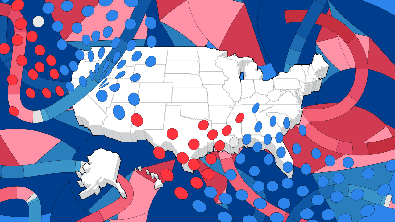 I’m still scarred from 2016. With an abiding faith in polls and data visualization, I trusted, like so many other people, that Hillary Clinton was a shoo-in for the presidency.
But even the best minds got it wrong. The polling was off by greater margins than ever before. And for all the maps, meters, and calculators that seemed so easy to read, there was an unintended consequence: The news outlets failed to depict the margin of error behind polling data—a margin of error that Hillary’s seemingly epic lead was actually well within. (You can read our full breakdown of what happened here.)
So I’ve abstained as much as possible from following the latest election infographics this year. However, as we approach election night November 3—knowing full well that because of mail-in voting, we might not actually know our next president by the end of the night—I feel the itch coming back. I need to follow the election results. You need to follow the election results. Who should we be following?
It’s a question that I posed to three prominent data designers: Which publications are they referencing to stay up-to-date, and who will they be obsessively refreshing on election night? Here are their answers.
FiveThirtyEight
In 2016, many people followed FiveThirtyEight religiously, as the site’s founder, Nate Silver, made his name calling the 2008 election for Obama months early. Eric Rodenbeck, founder of the cartography-focused data viz firm Stamen, was among the site’s fans who had their hearts broken by the actual election results.
“Despite a feeling of trauma and trepidation from the last time, FiveThirtyEight is still my go-to,” says Rodenbeck. “I like that the whole map updates when you pick a state winner. It uses your input to narrow things down to just the simulations that fit your inputs. There’s a video on how to use it that’s pretty informative.”
As Rodenbeck explains, FiveThirtyEight’s map allows you to analyze current projections, then tap on individual states to see what happens if Biden takes Florida or Trump takes Michigan again. And if you want a bit more insight into the map’s invisible logic, data viz expert Adam Pearce actually compared FiveThirtyEight’s model to that of The Economist. It’s a short, geeky read that might not leave you any more certain about which resource to follow this election, but it does work well to highlight how advanced statistics can boil down to reading tea leaves.
Source: Fast Company
Powered by NewsAPI.org