Analysis: This is the best map of the 2020 election you'll see - 3 minutes read
 (CNN) Maps -- especially in politics -- can be misleading. Especially when you are talking national elections.
"Oh I love those beautiful red areas that middle of the map," Trump said of the map in March . "A little blue here, a little blue there, and everything else ... everything else is bright red."
This map is, of course, hugely misleading. Yes, it is true that Trump won 2,626 counties to Hillary Clinton's 487 in 2016, according to The Associated Press . But it's also true that more than half of the US population resides in just 143 counties nationwide, as Haya El Nasser wrote on the US Census website back in 2017.
Which means that Trump's favorite map shows that if land voted, he would have won a massive, sweeping victory in 2016. Which he didn't. Because people vote. (Trump lost the popular vote by nearly 3 million votes to Clinton, but won the Electoral College.)
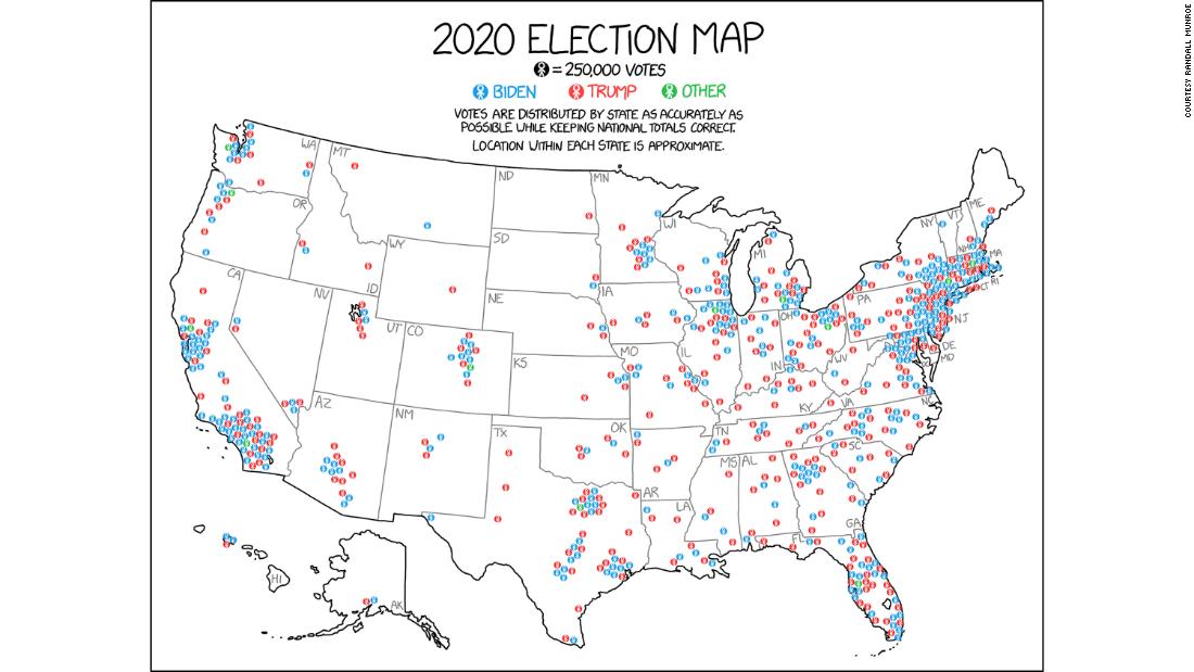
All of which brings me to the 2020 election. And the single best map to understand what happened and where the votes came from to deliver a victory to President-elect Joe Biden.
It comes from the pen (and brain) of Randall Munroe, who is behind the terrific XKCD website, which he describes as "a webcomic of romance, sarcasm, math, and language."
What the XKCD map attempts to show is a) where the majority of Americans live and b) how they voted for president. It adjusts for land since, again, land doesn't vote. As Munroe explained in a tweet thread on the map
"This map looks similar to some other election maps out there, but it's a little unusual. It tries to address something that I find frustrating about election maps: Very few of them do a good job of showing where voters are. (Brief thread, because I am enthusiastic about maps!)
"People often focus on the idea that election maps over-emphasize sparse rural areas with few people, but a deeper problem is that the maps imply that 'areas' have political leanings at all. Spots on the map belong to many overlapping areas won by different sides.
"You can be a Biden voter in a Trump household in a Biden precinct in a Trump county in a Biden district in a Trump state in a Biden country. Then what color is your land? Dirt-colored, I guess! Not only does land not vote, it doesn't even have a preference."
I like Munroe's map so much because it gets us away from the traditional red-blue dynamic, painting counties and even states with very broad brushes. It shows there are plenty of Democrats in some parts of Alabama and lots of Republicans even in Southern California. We aren't just colors on a map. The politics of the country are far more complex (and interesting!) than that.
"There are more Trump voters in California than Texas, more Biden voters in Texas than NY, more Trump voters in NY than Ohio, more Biden voters in Ohio than Massachusetts, more Trump voters in Massachusetts than Mississippi, and more Biden voters in Mississippi than Vermont."
Source: CNN
Powered by NewsAPI.org